
Color Therapy: Light, Mood, and the Lens You Choose
For over a thousand years, cultures around the world have explored the healing power of color. From ancient Egypt to Ayurvedic traditions, color was never just visual—it was vital. Known as Chromotherapy, this practice centers on the idea that our bodies absorb energy from colored light across the visible spectrum. And each hue carries its own effect.
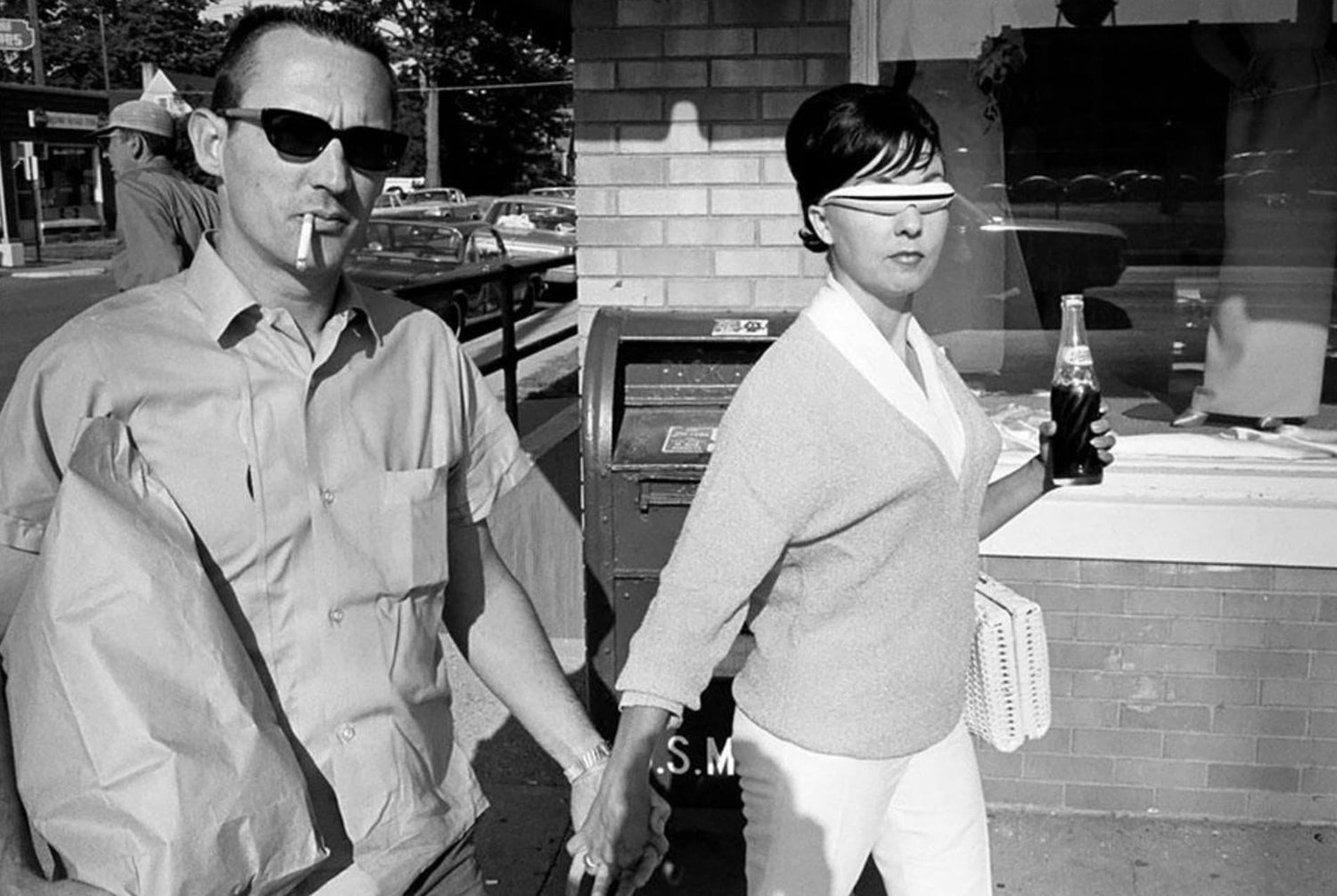
At AZYR Specs, we believe in the power of intentional choices—down to the lens you wear. Our Color Therapy capsule is designed to let you shift your state of mind with something as simple (and stylish) as your glasses. Whether you need calm, confidence, or creative clarity, the right tint can help set the tone.

So, what color fits your mood today?
🔴 Red – Vitality, Confidence, and Strength
Red lenses are energizing. They boost circulation, confidence, and mental alertness. Wear them when you need a jolt of motivation or want to feel grounded and powerful.
🟢 Green – Harmony, Love, and Relaxation
Green lenses are restorative. Often linked to heart energy and balance, this tint can help calm anxiety and encourage feelings of peace and connection.
🌸 Pink (Baker-Miller Rose) – Calm, Control, and Softness
This shade has been scientifically studied for its ability to reduce aggression and promote emotional relaxation. Pink lenses can be surprisingly effective when you need to reset your nervous system.
🟡 Yellow – Clarity, Creativity, and Positivity
Yellow lenses bring brightness—literally and mentally. They’re linked to focus, confidence, and elevated mood. Ideal for brainstorming, speaking engagements, or simply lifting your spirits.
🔵 Blue – Communication, Trust, and Calm
Blue lenses enhance clarity in conversation and encourage openness. They’re soothing and cooling, perfect for decompressing or grounding your thoughts.
More Than Color. It’s Frequency.
Wearing Color Therapy glasses for just 10–30 minutes a day has been linked to improved mood, increased focus, and reduced stress. Whether you’re managing anxiety, working through creative blocks, or simply looking for a midday reset, color lenses offer a non-invasive way to realign.
At AZYR, we see eyewear as more than fashion—it’s function, emotion, and ritual. That’s why our curated Color Therapy 5-Pack gives you the freedom to match your lenses to your needs. One frame, five perspectives.
Rainbows appear when visible light is broken apart by water droplets that bend sunlight and split it into different wavelengths. [RELATE TO HAVING COLORED LENSES WHILE SWIMMING OR GOING TO THE BEACH]
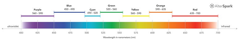
What’s a color wheel? It’s the light spectrum, spun in a circle, closing back in on itself.
Primary Colors
Secondary Colors
Some key color terms
The three most important technical terms that help us understand the link between color and emotion are hue, brightness, and saturation. In this section, I’ll describe them, and then show you how they are all related.
Hue
Hue is the term most people use to describe different colors, such as red, orange, purple and so on. Hue is synonymous with wavelength most of the time, except for the non-spectral colors like pink and brown.

Brightness
One of the key factors in color psychology is the level of brightness in a color. You will also see brightness referred to as ‘value’. It represents the quality of a color from dark to light, or when it comes to pigments, how much black or white exists is in a color.
The three main terms used to describe brightness are shade, saturation, and tint, which are defined as follows:
Shade
The shade describes how dark a color appears, as it moves from its vivid color towards black. As a color becomes more shaded, it’s synonymous to having the lights slowly dimmed, till you can only see black.

Saturation
Saturation describes how a color transitions from its most vivid appearance towards a grey appearance. A highly saturated color is a vivid, pure hue. As we desaturate the color, it becomes less saturated and starts to appear gray and washed out.

Tint
As the vivid color moves towards white, we have tint. It’s the opposite of shade.